The Xiaomi MIUI Control Center remains an important function of the Chinese OEM Android skin. With the unveiling of MIUI 12, the company revamped the looks, bringing it closer to what’s obtainable in Apple iOS. They’ve also made some adjustments with the release of MIUI 13, with the introduction of Mi Smart Hub and moving the volume and brightness slider to the four big quick settings at the top. Perhaps, another change might be on the horizon, as a new MIUI control center design appears online.
Recently, we have started seeing reports of the upcoming MIUI 13.5 upgrade. Interestingly, devices that would receive this supposed update have surfaced, while many features are being tested by Closed Beta Testers in China that are likely to arrive with the update. Perhaps, a new MIUI control center design might be part of the changes.
About the new MIUI control center design
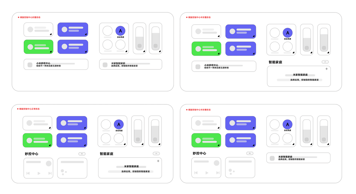
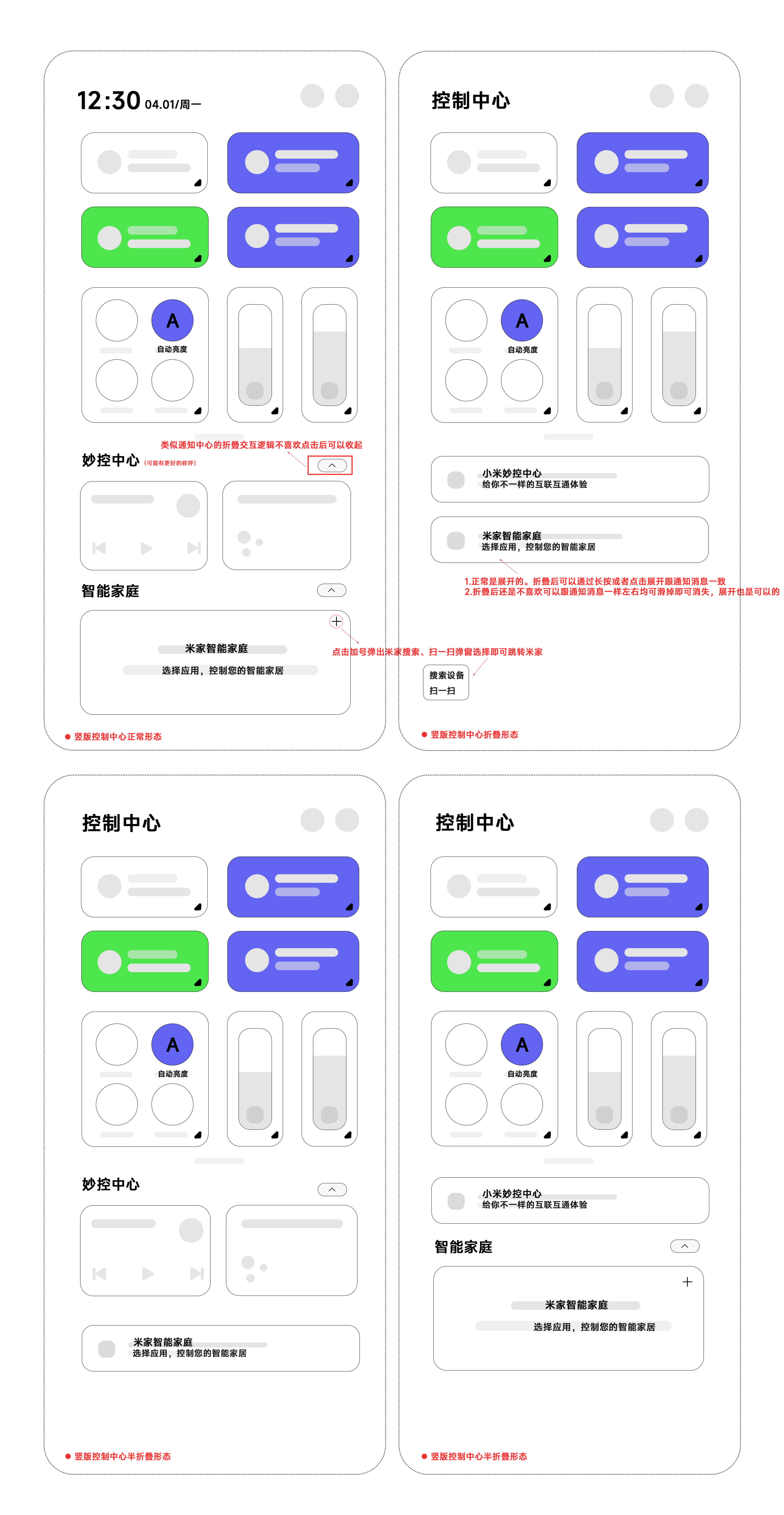
A concept image of a new MIUI Control Center design has been shared by Mi Fans. There’s a chance this design wouldn’t be making it to Xiaomi phones, but it seems to interest the fans. Perhaps, the concept also considers Xiaomi phones with large screens, probably tablets, and foldable phones.
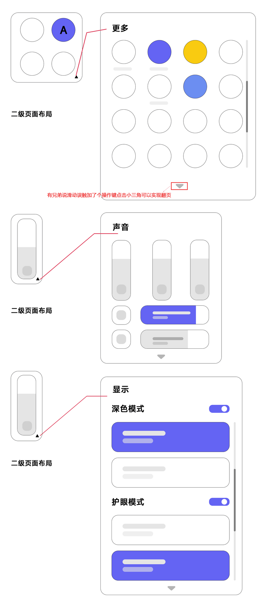
The first concept image looks like the MIUI 12 control center. It has the volume and brightness slider below the four big quick settings area with four quick settings sitting beside it. The second image, probably for Tablets and foldable, has all the quick settings arranged horizontally. We understand that the other quick settings can be accessed on the secondary page layout when you swipe left.
While the new MIUI control design is only a concept design, it seems to go well with many users. But it will likely not make it to Xiaomi phones, as it looks just like the current version, with minor changes. Nevertheless, we hope to update this post if there’s ever an official claim about the new design.


