WhatsApp has improved its functionality by introducing some important features, but the design remains unchanged. That’s about to change as a new report suggests that WhatsApp is working on a major design, that will see the app with a new look.

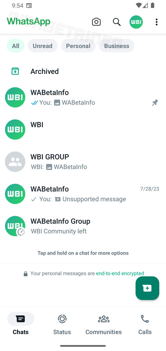
WhatsApp recently released a beta version of its app, which carries a version number V2.23.13.16 on Android. After installing the app, folks on WABetainfo discovered new changes coming to the messaging app. From the images posted, WhatsApp has replaced the darker green top bar with a white design. The WhatsApp logo didn’t change its location, along with the camera icon, search, and the three-dot lines. Meanwhile, a user profile picture has been added to the overflow menu.
Interestingly, there are new tabs at the top of the chats list. With the new WhatsApp design, it will be easy to access unread messages. Also, the app will differentiate between personal and business chats. Perhaps messages from Business WhatsApp will be grouped under business.
Meanwhile, tabs like Chat, Status, Communities, and Calls have been moved to the bottom. It also has a white background, which is pleasing to the eyes. There’s a new floating button for starting new chats.
We understand the chat filters at the top, and the button bar was first seen in June. Unfortunately, WhatsApp isn’t releasing it to the public yet, as it remains beta exclusive. We also don’t know when the company will make new Whatsapp design available for everyone, but we expect it soon.
