Nokia, which seems to have collapsed, has got something coming for the Android community – this time, it has to do with software. Say hello to Nokia’s new user interface, Pure UI. Let’s take a look at what’s up with it.
Features of Pure UI
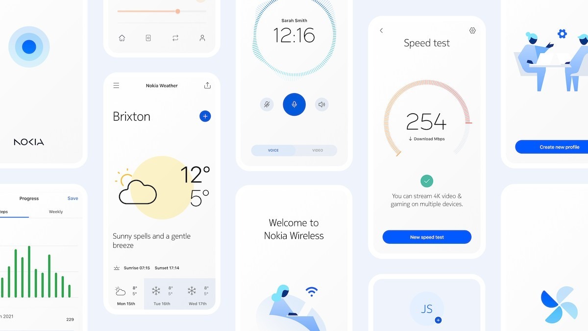
The Nokia Design Team has created Pure UI, a new user interface design language. This is designed to be used on Nokia phones, but also on a variety of other Nokia items.
The design is designed to be consistent, versatile, and future-proof, and it has a clean, minimalistic appearance, which is now the leading design trend. There are several components, beginning with templates and guidelines that shape the overall appearance.
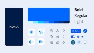
The Nokia Pure font, which will be utilized across the Pure UI, is a key component of the new appearance. Pure has received new icons as well. They are based on strokes, the thickness of which may be adjusted to meet the display needs and capabilities of a particular device. Smooth animations are also used when a certain component has to attract the user’s attention.
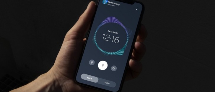
In addition, the Nokia team has created standard components that designers may utilize to easily create consistent-looking interfaces. Of course, dark mode is supported, with components and icons altering their designs accordingly. So far, Nokia phones have maintained a strong resemblance to standard Android, but we expect to see a push toward Pure Ul adoption.
There’s no word on how quickly that will happen. Again, this will be utilized on phones, but also on other devices; for example, Nokia Pure UI contains sophisticated components that can be used to create complicated web-based dashboards. The interface is intended to be scaled from small wrist-worn screens to big wall-mounted panels.


