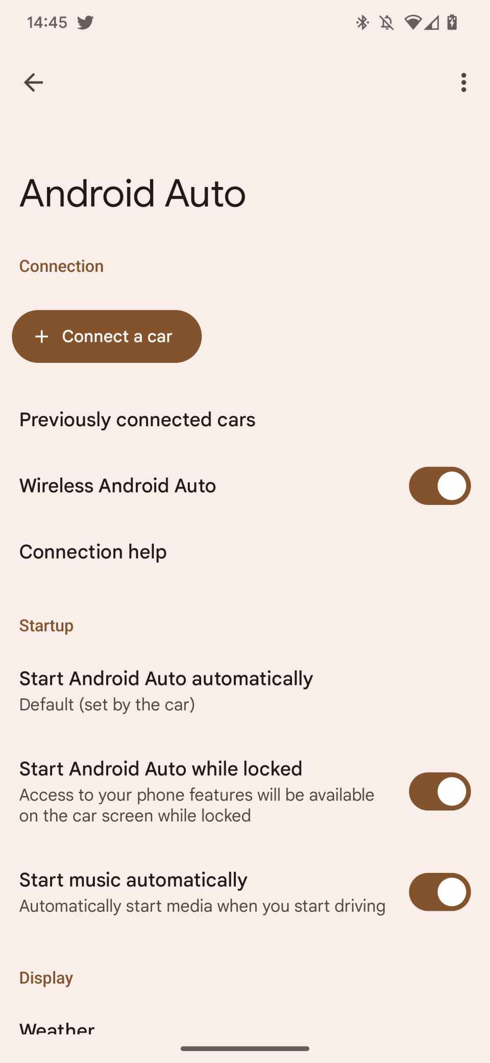
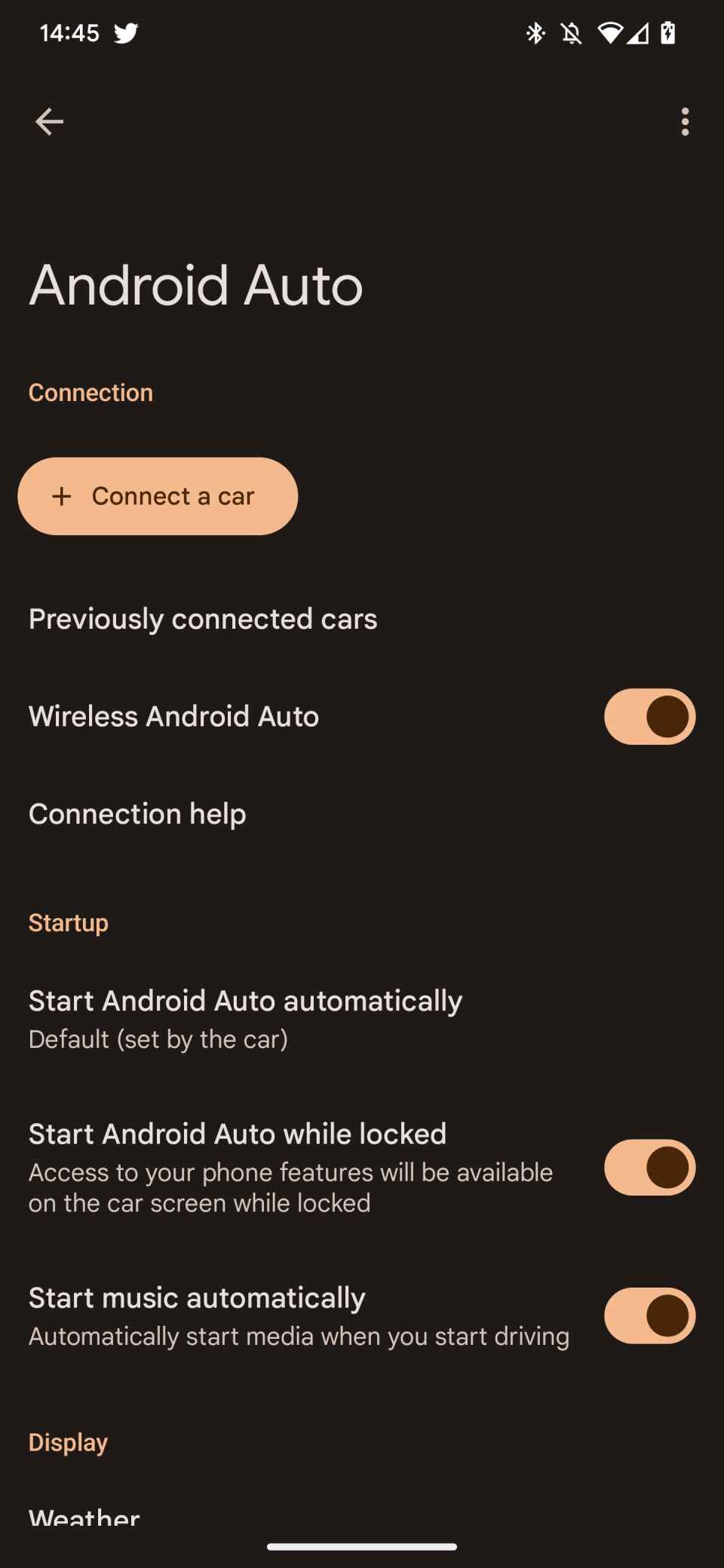
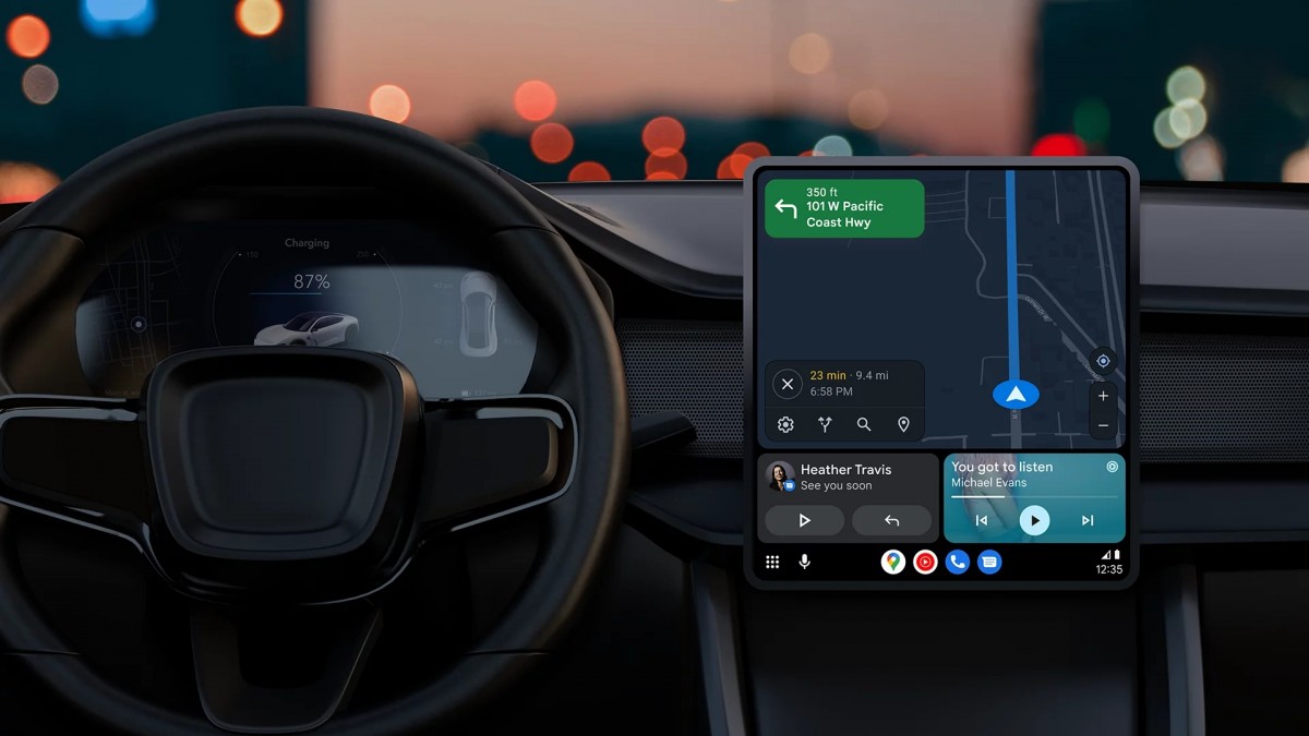
Android Auto has been the topic of this period given the new rollout of the Coolwalk design – a feature that has been long anticipated after several Android Auto beta releases. Well, joining this tweak is the Settings menu for Android Auto getting a dark mode Material You – talk about something stylish from the Big G.


Settings Menu for Android Auto is one that isn’t accessed most of the time and when you eventually try to open it, it’s a bit sluggish but still opens. The previous design before the just-seeded one has been there since 2020 being not too stylish. – as in there wasn’t anything special with the layout or UI.
It was just the Settings menu for Android Auto blending with the stock Android feel. Furthermore, there wasn’t a dark mode which is a feature most smartphone users fancy a lot.
The dark mode for Settings Menu for Android Auto is coming in via the?
Like Google has read the mind of most individuals using Android Auto, the brand has decided to do something about the dark mode. Via the Android Auto 7.5 update, users get a dark mode plus Material You. The whole new setup gives accent colours and is quite stylish, clearer and cleaner.
As interesting as this feature is, some users might not want to get in on the Dark mode feature, Google enables the ability to switch between dark and light themes to solve that riddle. (You can decide to switch between the two themes to compare as well). This feature isn’t widely available yet, however, Roussel from 9to5google was able to manually enable it(the screenshot from the change has been shared in this article).
Meanwhile (as mentioned earlier), the Setting Menu for Android Auto isn’t the only section getting a revamp. The long-anticipated Coolwalk redesign has been rolled out to the software, although it’s still for a few beta testers with the consumer launch at the corner.
