Google had hinted at a new Android Auto redesign since the I/O in May. Ever since Google has rolled out a series of Android Auto updates but none has borne the feature, quite unfortunate. However, reports have it that the redesign might just be the latest Android Auto UI design that’s available for public beta testers currently.


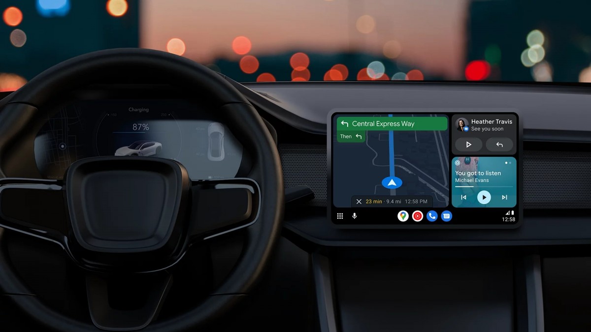
The Play Store listing that hints at the latest Android Auto UI design says there are no more slots open for more beta testers. So if you’re not a beta tester, you’ll have to wait a little more for the public rollout. The latest Android Auto UI design brings in a lot of UI enhancements, the controls are more reachable and the split screen should be improved.
Here are full details of the latest Android Auto UI design
Here are the changes the latest Android Auto UI design brings:
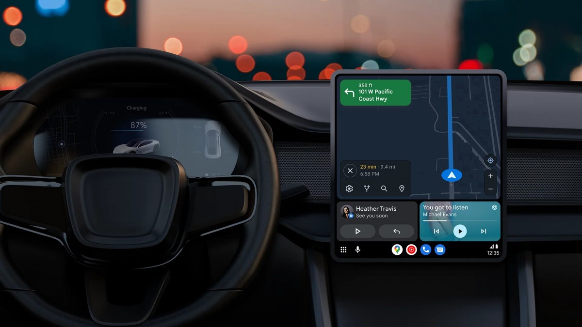
- Your map will now be closer to the driver in the new dashboard with improved size/reachability.
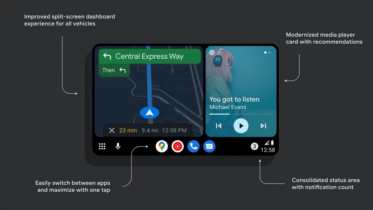
- The dashboard media card has a completely new look and now grows and shrinks dynamically.
- You can now make the map fill the entire Android Auto-area, giving users more choices to pick layouts on large screens.
- There’s a new app dock in the rail to make it easy to switch between recent apps with one tap.
- More parts of the system have been updated to adopt Material You and modernized UI components and layouts.
- Music and media recommendations from Google Assistant can now be accessed with one swipe of the dashboard media card.
- The old status icons and notification centre bell have been merged into one easy-to-parse, tappable area on the rail that includes the number of unread messages
We’re still in a gray area as to when the full release of the latest Android Auto UI design will be available but we’ll keep you posted once it shows up.
