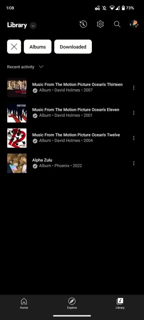
The YouTube Music has been receiving a lot of tweaks from WearOS to the general UI but never have we heard of a Library Redesign. A Library Redesign was noticed some time ago but the brand decided to remove it a few weeks later. Well, the new Library Redesign is back for the YouTube Music app and with some additional tweaks to support it.
What’s with the new Library Redesign for the YouTube Music app?
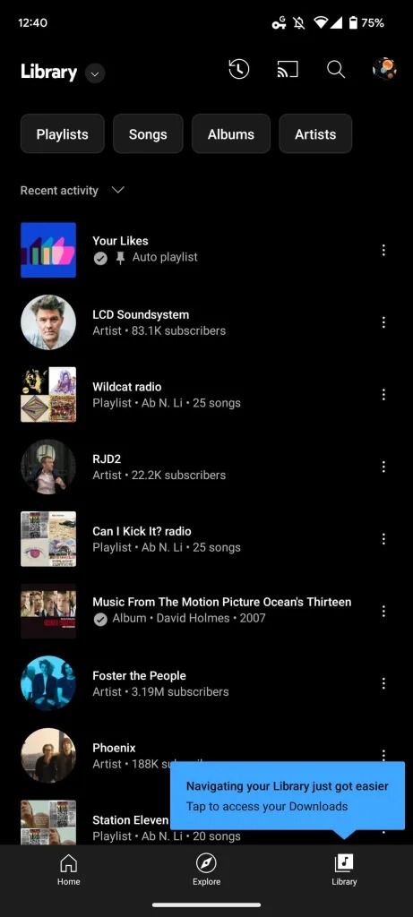
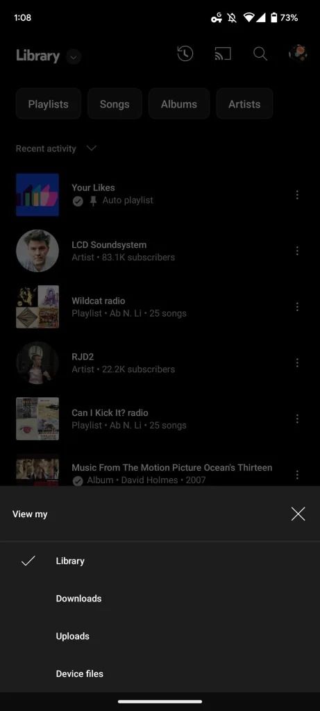
First off, the new Library Redesign will be rolling out to the Android and iOS versions of the app, that is version 5.38 and 5.39 respectively – you have to force stop that on iOS before installing the new version. The UI is getting a change in which the Recent Activity carousel is removed and replaced with easy access to your playlist, songs and albums as well. The library tab then offers you a drop-down menu where you will see the Library, Downloads, Upload and Device files. This menu can still be accessed by tapping on the carousel twice.
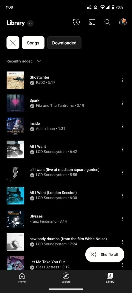
There’s the Account, History, Search and Cast tab at the top(to the right) and then filter chips with categories Album, Songs, Playlists and Artists to help you with what you’re looking for in your YouTube Music library. You’ll notice a downloaded filter after tapping on the first three buttons and then a subscription filter when you tap on the Artist filter.
Having filtered your results, you will notice another drop-down menu that will help sort out what you got from your filter search. You can choose from Recent activity, Recently Added, Recently played, and alphabetically. Meanwhile, the tab’s default floating action button is replaced with shuffle all. Lastly, you know the thing with updates, it’s a gradual process and as such it might not be available to everybody currently.
